Excel Data Analysis and Data Visualization
Technologies used:
Microsoft Excel (Data Analysis and Data Visualization)
I have been working with Excel to analyze and visualize data, turning complex datasets into clear insights via dynamic charts and graphs that make information accessible and easy to interpret. I enjoy using data to support informed decision-making and to simplify complex processes. Below I describe several data analysis and visualization projects using Excel. If you want to take a closer look, you can also download my files below.
Download my Excel projects and take a closer look:
Payroll
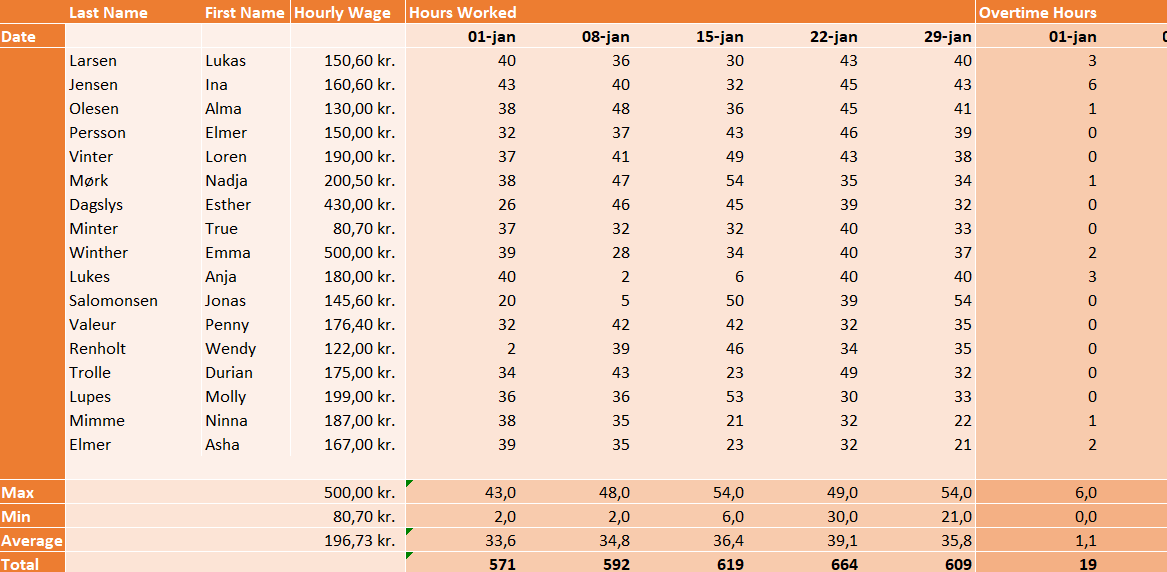
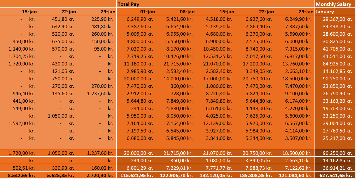
In my Payroll-project I have been working on creating a fictional payroll dataset which calculates several employees weekly and monthly salary based on their hourly pay and their overtime bonuses. The dataset includes minimums, maximums, averages and totals in each column. I am using conditional statements to calculate the potential overtime bonuses.
Employee Courses
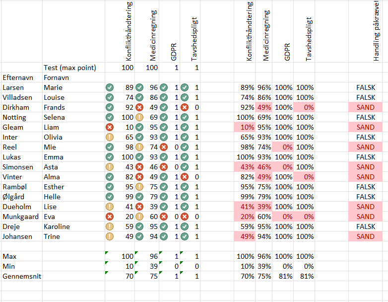
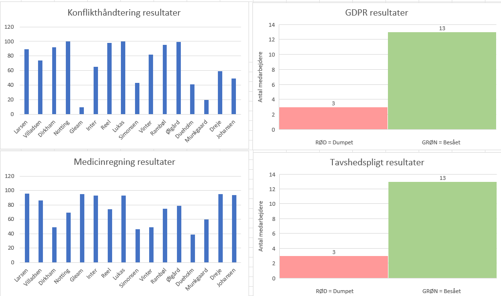
In my Employee Courses-project I have been working on creating a fictional employee course completion dataset which provides an overview of four different courses and how the fictional employees have scored in each course. The dataset includes minimums, maximums, averages and totals in each column. I am using conditional statements to calculate the potential overtime bonuses. The dataset includes conditional formatting to show green, yellow or red marks at the course scores, and it includes a column called “action needed” with true or false statements for the employees who failed one or more courses. The dataset includes data visualization via bar charts showing how well the employees did on the courses.